Showing posts with label regression output. Show all posts

Saturday, 24 March 2018

Time Series Analysis (Lecture 4 Part 1): Johansen Cointegration Test in EViews

After unit root testing, what next?
The outcome of unit root testing matters for the empirical model to be estimated. The following scenarios explain the implications of unit root testing for further analysis.  Still drawing on the previous tutorials (see here for EViews, Stata and Excel) on unit root testing with the augmented Dickey-Fuller procedure (see videos), we are using the same data from Gujarati and Porter Table 21.1 quarterly data of 1970q1 to 1991q4. The variables in question are pce, pdi and gdp in natural logarithms.

Scenario 1:  When series under scrutiny are stationary in levels.
In this scenario, it is assumed that lnpce, lnpdi and lngdp are stationary in levels, that is, they are I(0) series (integrated of order zero).  In this situation, performing a cointegration test is not necessary. This is because any shock to the system in the short run quickly adjusts to the long-run. Consequently, only the long run model should be estimated using OLS (where variables are neither lagged nor differenced). It is the static form of the model. In essence, the estimation of short run model is not necessary if series are I(0).  

Scenario 2: When series are stationary in first differences.
1.    Under this scenario, the series are assumed to be non-stationary but became stationary after first difference
2.    One special feature of this is that they are of the same order of integration.
3. Under this scenario, the model in question is not entirely useless although the variables are unpredictable. To verify further the relevance of the model, there is need to test for cointegration.  That is, can we assume a long run relationship in the model despite the fact that the series are drifting apart or trending either upward or downward?
4. There are however, two prominent cointegration tests for I(I) series in the literature. They are Engle-Granger cointegration test and Johansen Cointegration test.
5. The Engle-Granger test is meant for single equation model while Johansen cointegration test is considered when dealing with multiple equations.

If there is cointegration:
1.    Implies that the series in question are related and therefore can be combined in a linear fashion.
2.  That is, even if there are shocks in the short run, which may affect movement in the individual series, they would converge with time (in the long run).
3.    Estimate both long-run and short-run models.
4. The estimation will require the use of vector autoregressive (VAR) model and vector error correction model (VECM) analysis.

If there is no cointegration:
1.    Estimate only the short-run model, which is VAR and not VECM.

Johansen Cointegration Test in EViews
The hypothesis is stated as:
H0: no cointegrating equation
H1: H0 is not true
Rejection of the null hypothesis is at the 5% level.

Note: Cointegration test should be performed on the level form of the variables and not on their first difference. It is okay to also use the log-transformation of the raw variables, as I have done in this example.
Steps:
1.   Load data into EViews (see video on how to do this)
2.   Open as Group data (see video on how to do this)
3.   Go to Quick >> Group Statistics >> Johansen Cointegration >> dialog box opens >> list the variables >> Click OK >> Select option 3 [Intercept (no trend)] >> Click OK

Here is the EViews result on the Johansen Cointegration test of lnpce, lnpdi and lngdp:
EViews - Johansen Cointegration Test from cruncheconometrix.com.ng
EViews - Johansen Cointegration Test
Source: CrucnhEconometrix
Interpreting Johansen Cointegration Test Results
1.   The EViews output releases two statistics, Trace Statistic and Max-Eigen Statistic
2.   Rejection criteria is at 0.05 level
3.   Rejection of the null hypothesis is indicated by an asterisk sign (*)
4.   Reject the null hypothesis if the probability value is less than or equal to 0.05
5.   Reject the null hypothesis if the Trace or Max-Eigen statistic is higher than the 0.05 critical value

Decision: Given the results generated, the null hypothesis of no cointegrating equation is rejected at the 5% level. Hence, it is concluded that a long-run relationship exist among the three variables.

 [Watch video on how to conduct Johansen cointegration test in EViews]

However, if the null hypothesis cannot be rejected, it evidences no cointegration and hence there is no long-run relationship among the series. This implies that, if there are shocks to the system, the model is not likely to converge in the long-run. In addition, if there is no cointegration, only the short run model should be estimated. That is, estimates only VAR do not estimate a VECM!

If there are comments or areas requiring further clarification, kindly post them below….

Wednesday, 14 February 2018

Time Series Analysis (Lecture 2): Choosing Optimal Lags in Stata


General Overview on Lag Selection

Since this blog is tailored for beginners in econometrics, I will not be engaging an advanced discussion on the topic but an introductory approach by which a beginner can understand the essence of using lags in a model and the pitfalls that may occur if lags are excessively used. Interested readers who require advanced information on selecting optimal lags can consult appropriate econometric textbooks. Having said that, in economics the dependence of a variable Y (outcome variable or regressand) on another variable(s) X (the predictor variable or regressor) is rarely instantaneous. Very often, Y responds to X with a lapse of time. Such a lapse of time is called a lag. Therefore, in time series analysis, some level of care must be exercised when including lags in a model.


So how many lags should be used in a model? There is no hard-and-fast-rule on the choice of lag length. It is basically an empirical issue. As noted in Damodar Gujarati Basic Econometrics, there is no a priori guide as to what the maximum length of the lag should be. The researcher must bear in mind that, as one estimates successive lags, there are fewer degrees of freedom left, making statistical inference somewhat unstable. Economists are usually not that lucky to have a long series of data so that they can go on estimating numerous lags. More importantly, in economic time series data, successive values (lags) tend to be highly correlated increasing the likelihood of multicollinearity in the model.

Also, from Jeffery Wooldridge’s Introductory Econometrics: A Modern Approach with annual data, the number of lags is typically small, 1 or 2 lags in order not to lose degrees of freedom. With quarterly data, 1 to 8 lags is appropriate, and for monthly data, 6, 12 or 24 lags can be used given sufficient data points. Again, in the words of Damodar Gujarati Basic Econometrics “the sequential search for the lag length opens the researcher to the charge of data mining”. He further stated that the nominal and true level of significance to test statistical hypotheses becomes an important issue in such sequential searches”. For instance, if the lag length, k, is incorrectly specified, the researcher will have to contend with the problem of misspecification errors. In addition, because of the lags involved, distributed and or autoregressive models raise the topic of causality in economic variables.

Hence, before you estimate a time series equation, it is necessary to decide on the maximum lag length. Like I mentioned earlier, this is purely an empirical question. Suppose there are 40 observations in all, by including too many lagged values, your model consumes degrees of freedom, not to mention introducing the likelihood of multicollinearity occurring. As noted in my previous tutorial on multicollinearity, it leads to imprecise estimation; that is, the standard errors tend to be inflated in relation to the estimated coefficients. As a result, based on the routinely computed t ratios, we may tend to declare (erroneously), that a lagged coefficient(s) is statistically insignificant. In the same vein, including too few lags will lead to specification errors. The easiest way out of this quagmire, is to decide using a criterion like the Akaike or Schwarz and choose that model that gives the lowest values of these criteria. Most econometric packages easily compute these optimal lag length but note some trial and error is inevitable.

Choosing Optimal Lags in Stata

For this tutorial, I will extract data from Gujarati and Porter Table 21.1 dataset. It is a quarterly data on United States from 1970 to 1991, which is 88 observations. The variables are gdp (gross domestic product), pdi (personal disposable income) and pce (personal consumption expenditure).

Step 1: Load data into Stata
 
Stata Dataset from cruncheconometrix.com.ng
Stata Dataset
Source: CrunchEconometrix
 Step 2: Prepare Stata for Analysis
Inform Stata that you are about to perform a time series analysis by typing this code into the Command box: tsset qtrly

and you will obtain this response:
Stata - tsset Command from cruncheconometrix.com.ng
Stata - tsset Command
Source: CrunchEconometrix
Stata now recognises that you are about conducting a time series analysis using quarterly data from 1st quarter of 1970 to the 4th quarter of 1991. If you don’t issue this command, Stata will not run your analysis.

Step 3: Obtain Model Lag Length
Type this code into the Command box: varsoc gdp pce pdi

…and the Stata output for the model (shown below) indicates that lag 2 is the optimal lag and that AIC is the best criterion for the model given it has the lowest value, 26.8144.

Stata - Optimal Lags for the Model from cruncheconometrix.com.ng
Stata - Optimal Lags for the Model
Source: CrunchEconometrix

Step 4: Obtain Variables Lag Length
Optimal lags can be obtained for the respective variables and the rule-of-thumb remains the same. We select that lag identified by the criterion which gives the lowest value.

So, for gdp, type this code into the Command box: varsoc gdp

…and the Stata output indicates that the optimal lag length for gdp is 2.

Stata - Optimal Lags for gdp from cruncheconometrix.com.ng
Stata - Optimal Lags for gdp
Source: CrunchEconometrix

 To obtain optimal lag for pce, type: varsoc pce

…Stata output indicates that the optimal lag length for pce is 4.

Stata - Optimal Lags for pce from cruncheconometrix.com.ng
Stata - Optimal Lags for pce
Source: CrunchEconometrix

 varsoc pdi
…Stata output indicates that the optimal lag length for pdi is 1.

Stata - Optimal Lags for pdi from cruncheconometrix.com.ng
Stata - Optimal Lags for pdi
Source: CrunchEconometrix

Caveat: There are also cases where the used lag length is that which is most selected by the criterion named after the econometricians who developed them, like HQ, SIC, AIC and LR, etc. Some researchers prefer Schwartz criterion when the variables are more than 4 and use the AIC when the variables are less than 4. As, mentioned in the introductory part of this tutorial, the decision on the choice of lag is purely an empirical issue. Generally, we choose the lag length for which the values of most of these lag length criteria are minimized, indicated by asterisks in the EViews output.

[Watch video tutorial on lag selection using Stata]

Having gone through this tutorial, it will be easy for you to determine the optimal lag for your model regardless of the analytical package used. The basics are the same. Remember that “Lag length criteria” indicate a definite way of selecting the optimal lag after estimating the initial VAR model (in EViews). Also VAR and ARDL models are susceptible to arbitrary use of lags as this may erode the degrees of freedom, weaken the significance of the coefficients, may induce auto-correlation and weaken the strength of diagnostic tests.

Try these steps on your models and if there are further and comments, do post them below…..

Monday, 12 February 2018

Excel: How to Interpret Regression Output

How to Interpret Regression Output in Excel

The dissertation buzz is on and students are doing everything possible to meet up with the deadline. This is the current atmosphere in tertiary institutions, at least for those with undisrupted academic calendar J. The students are in different stages of their project, as it is commonly called. Some are yet to wrap up their chapter one which gives the “study background” and the framing of research hypotheses, objectives and questions. Some have moved on to chapter two reviewing relevant literature related to their scope of study. Others have gone further in developing both the theoretical and empirical frameworks for chapter three, but not without the usual teething lags…but they’ll get around it, somehow J. A handful have even done better by progressing to chapter four attempting to analyse their data.

Since, chapters one to three are relative to each students’ scope of research, however, a regression output is common to all (although actual outcomes differ). It is based on this that I decided to do a tutorial in explaining the basic features in a regression output. Likewise, this write-up is in response to requests received from readers on (1) what some specific figures in a regression output are and (2) how to interpret their results. Let me state here that regardless of the analytical software whether Stata, EViews, SPSS, R, Python, Excel etc. what you obtain in a regression output is common to all analytical packages (except where slight variations occur).

For instance, in undertaking an ordinary least squares (OLS) estimation using any of these applications, the regression output will churn out the ANOVA (analysis of variance) table, F-statistic, R-squared, prob-values, coefficient, standard error, t-statistic, degrees of freedom, 95% confidence interval and so on. These are the features of a regression output. However, the issue is: what do these mean and how can they be interpreted and related to a research.

Hence, the essence of this tutorial is to teach students the relevance of these features and how to interpret their results. I will be using Excel analytical package to explain a regression output, but you can practise along using any analytical package of your choice. (See tutorial for Stata and EViews users).

An Example: Use Gujarati and Porter Table7_12.dta or Table7_12.xlsx dataset
Note: I will not be discussing stationarity or cointegration analysis in this tutorial (that will come later on). Since the issue on how to understand the features of a regression output and interpret results, I will just be doing a simple linear regression analysis (a bi-variate analysis) with only one explanatory variable.

The dataset is on the United States from 1960 to 2009 (50 years data). The outcome variable is consumption expenditure (pce) and the explanatory variable is income (income).

First step: get the Data Analysis Add-in menu
Before you begin, ensure that the DATA ANALYSIS Add-in is in your tool bar because without it, you cannot perform any regression analysis. To obtain it follow this guide:
File >> Options >> Add-ins >> Excel Options dialog box opens
Under Active Application Add-ins, choose Analysis ToolPak
In the Manage section, choose Excel Add-ins
Click Go, then OK

If it is correctly done, you should see this:
Excel Add-in Dialog Box from cruncheconometrix.com.ng
Excel Add-in Dialog Box
Source: CrunchEconometrix
And you will have the Data Analysis menu to your extreme top-right corner under Data menu:
Excel Data Analysis Menu from cruncheconometrix.com.ng


Second step: have your data ready
Here is the data in excel format:
Data in excel format from cruncheconometrix.com.ng


Third step: Visualise the relationship between the variables
Before analysing the data, it is good to always graph the dependent and key explanatory variable (using a scatter plot) in order to observe the pattern between them. This gives you what to expect in your actual analysis. Here’s the procedure:
1.    Highlight the 2 columns that contain the variables
2.    Go to Insert >> Charts >> Scatter

Excel - Scatter plot of pce and income from cruncheconometrix.com.ng
Excel - Scatter plot of pce and income
Source: CrunchEconometrix

The graph indicates a positive relationship between the two variables. This seems plausible because the higher your income, the higher will be your consumption, except you are very frugalJ.

The graph can be formatted by adding a trend line (see video on how to do this). In Excel, adding a trendline also gives you the linear prediction:

Excel - Scatter plot with trendline from cruncheconometrix.com.ng

As can be seen from the second graph, we have the linear prediction for pce and the R2.

Fourth step: The scientific investigation
Now we want to scientifically investigate the relationship between pce and income. To do this, go to Data >> Data Analysis (dialogue box opens) >> Regression >> OK. 

Excel - Data Analysis Dialogue Box from cruncheconometrix.com.ng
Excel - Data Analysis Dialogue Box
Source: Crunch Econometrix
Once you click OK, the Regression dialogue box opens:
Excel - Regression Dialogue Box from cruncheconometrix.com.ng
Excel - Regression Dialogue Box
Source: CrunchEconometrix

·      Put data range for pce under Input Y Range
·      Put data range for income under Input X Range
·      Check label box
·      Check Confidence Level box
·      Check Output range
·      Click OK
(You have simply told Excel to regress the dependent variable, pce, on the explanatory variable, income), and the output is shown as:

Excel - Regression Output from cruncheconometrix.com.ng


Fifth step: The features of a regression output
The Excel output gives the Regression Statistics and the ANOVA table. So what do these figures mean? I will explain each feature in turns.

Under “Regression Statistics”:
R-squared: gives the variation in pce that is explained by income. The higher the R2, the better the model and the more predictive power the variables have. Although, an R2 that equals 1 will elicit some suspicion. The R is actually the correlation coefficient between the 2 variables. This implies that  
= the correlation coefficient.


Adjusted R-squared: this is the R2 adjusted as you increase your explanatory variables. It reduces as more explanatory variables are added.

Standard Error: this is the standard error of the regression

Observations: the data span is from 1960 to 2009 = 50 years

Under “ANOVA” (analysis of variance):
Source: there are two sources of variation on the dependent variable, pce. Those explained by the regression (i.e, the Model) and those due to randomness (Residuals)

df: this is degree of freedom calculated as k-1 (for the model) and n-k (for the residuals)

SS: implies sum of squared residuals for the Regression (explained variation in pce) and Residuals (unexplained variation in pce). After doing the regression analysis, all the points on pce do not fall on the predicted line. Those points outside the line are known as residuals. Those that can be explained by the regression are known as Explained Sum of Squares (ESS) while those that are due to random forces, which are outside the model are known as Residual Sum of Squares (RSS).
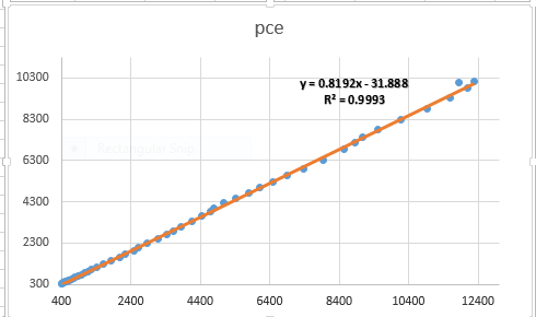
Excel - predicted Value of pce from cruncheconometrix.com.ng
Excel - Predicted Value of pce
Source: CrunchEconomterix
As observed from the graph, all the points do not fall on the predicted line. Some lie above, while some are beneath the line. These are all the residuals (in order words, the remnants obtained after the regression analysis). If the predicted line falls above a point, it means that pce is over-predicted (that is, pce – pcehat is negative) and if it is beneath a point, it implies that pce is under-predicted (that is, pce – pcehat is positive). The sum and mean of the residuals equals zero.

MS: implies mean sum of squared residuals obtained by dividing SS by df i.e. SS/df

F: captures whether the explanatory variable, income is significant in explaining the outcome variable, pce. The higher the F-stat, the better for the model.

Significance F: this is the probability value that indicates the statistical significance of the F ratio. A significance-value that is less than 0.05 is often preferred.

Coefficient: this is the slope coefficient. The estimate for income. The sign of the coefficient also tells you the direction of the relationship. A positive (negative) sign implies a positive (negative) relationship.

Intercept: this is the hypothetical outcome on pce if income is zero. It is also the intercept for the model.

Standard error: this is the standard deviation for the coefficient. That is, since you are not so sure about the exact value for income, there will be some variation in the prediction for the coefficient. Therefore, the standard error shows how much deviation occurs from predicting the slope coefficient estimate.

t-stat: this measures the number of standard errors that the coefficient is from zero. It is obtained by: coeff/std. error. A t-stat above 2 is sufficient evidence against the null hypothesis

P-value: there are several interpretations for this. (1) it is smallest evidence required to reject the null hypothesis, (2) it is the probability that one would have obtained the slope coefficient value from the data if the actual slope coefficient is zero, (3) the p-value looks up the t-stat table using the degree of freedom (df) to show the number of standard errors the coefficient is from zero, (4) tells whether the relationship is significant or not.

So, if the p-value is 0.3, then it means that you are only 70% (that is, (100-30)% ) confident that the slope coefficient is non-zero. This is not good enough. This is because a very low p-value gives a higher level of confidence in rejecting the null hypothesis. Hence, a p-value of 0.02, implies that you are 98% (that is, (100 - 2)% ) confident that the slope coefficient is non-zero which is more re-assuring! J.

Lower and Upper 95%: these are the confidence intervals. If the coefficient is significant, this interval will contain that slope coefficient but it will not, if otherwise.

Assignment:
Use Gujarati and Porter Table7_12.dta or Table7_12.xlsx dataset.
(1)  With pce as the dependent variable and gdpi as the explanatory variable, plot the graph of pce and gdpi, what do you observe?
(2)  Run your regression. Can you interpret the table and the features?
(3)  Plot the predicted line. What are your observations?

I have taken you through the basic features of a regression output using Excel data analysis software on ordinary least squares (OLS) model in a simple linear regression. So, you now have the basic idea of what the F-stat, t-stat, df, SS, MS, prob>F, p>|t|, confidence interval, R2, coefficient, standard error stand for.


[Watch video on "How to interpret regression output in Excel"]


Practice the assignment and if you still have further questions, kindly post them below....